
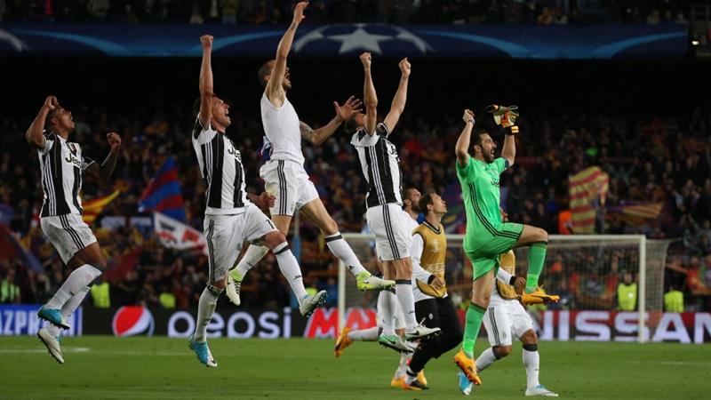
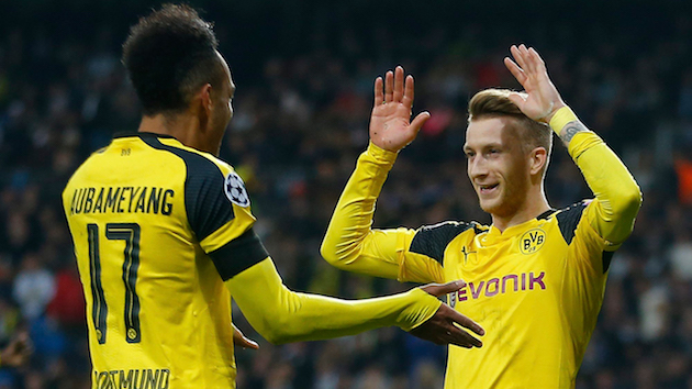
The Bundesliga’s Borussia Dortmund (BVB) go by the nickname die Schwarzgelben (literally, “the Black-Yellows”). In world football, these two colors have become more strongly associated with BVB than any other club, thanks to the club’s success as (usually) the Bundesliga’s second strongest club after Bayern Munich. For all the club’s success and their duo-colored nickname, however, the relationship between these two colors has been decidedly asymmetrical. In fact, the relationship between the colors has been overrun by a single color: Gelb, or yellow. Close your eyes and think Borussia Dortmund. Done? Chances are your mind made a picture of something mostly yellow with – perhaps – black accents.
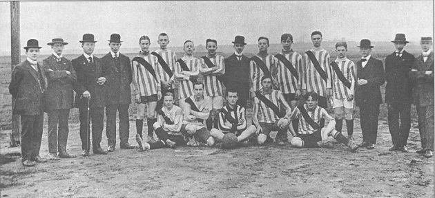
Famously, BVB switched to their now iconic colors in 1913 with a striped yellow and black kit. Before this, the club rocked blue and white striped shirts with a red sash and black pants (!). Old-time kits were a celebration of color, huh? Of course, today it’s impossible to imagine BVB in anything but their iconic (mostly) yellow and (some) black.
It makes sense that we’ve come to associate BVB with (mostly) yellow. For one thing, their black away shirts only first appeared in the 90s, yet even then it was only until 1995 that the black away shirt was repeated every season. So it’s not been until recently that black has even begun to claim its place on the BVB palette. Previously, Dortmund’s away shirts were various iterations of red (a la Liverpool!) or some blue and yellow get ups. Just take a peek at this page for some examples. Furthermore, today when BVB play on the road, they still frequently wear their bright home kit yellow, given how well this color contrasts with the home shirts of many other Bundesliga sides.
However, as club’s inaugural yellow and black stripped shirt reminds us, these two finely contrasting colors were originally envisioned as a more equally visibly pair.
So let’s not forget about the two colors representing BVB, especially black. And in the contemporary sporting fashion world of starkly contrasting home and away kits, you will mostly find black on Dortmund’s away kits. In this spirit, I present to you the 2014-15 Borussia Dortmund away kit:
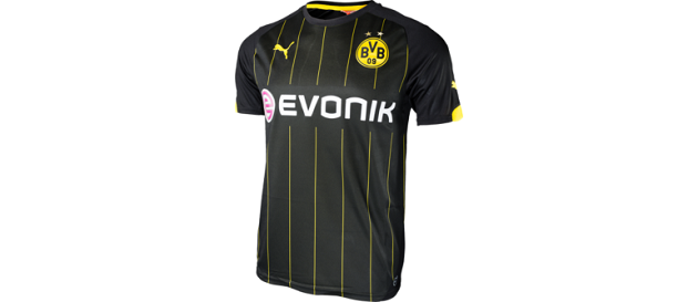
Another success. For back-to-back seasons, BVB has designed away shirt winners after the curious 2012-13 away kit and the hideous black to yellow gradation away kit from 2011-12. (Ironically, BVB won their very recent back-to-back Bundesliga titles in arguably some of their worst kit designs in the last decade. So it appears the correlation between kit design and fashion sense is purely random!) Moreover, the current 2014-15 design is a departure from other recent black away kit designs, which, for the most part, featured curved-line accents or a curved/straight line combinations.
The 2014-15 away kit has no pretensions of avant-gardism (e.g. Liga MX’s Pumas in 2013-14) or to the aforementioned gradation disaster from 2011-12. At first glance, the current BVB away kit is classic, crisp, vertically-aligned. It’s the kind of shirt you’d take home to your parents for that formal Sunday dinner. Or the kind of shirt you can settled down and buy a house with. You know, a “til death do us part shirt.” For example, my football-indifferent wife has already declared her admiration for the put together look of this shirt – she will happily be seen in public with me when I wear these threads. So yeah. Winner. (Let’s just say that any BVB home kit does not win this distinction!)
Let’s deepen our appreciation for the 2014-15 away kit’s design.
Start with the black. This shirt celebrates it. Black is the shirt’s field – no gimmicks. This consistency gives the shirt strong visual coherence. And even more than last season’s away kit with its thick yellow vertical stripe on each sleeve, this current version is more strongly black, which is certainly appropriate for what we call “blackout night” in American sports. Or menacing in fußball parlance.
The black shirt is structured vertically by the thin yellow pinstripes, which organize the front panel. These lines are unobtrusive enough to remain subtle, thanks to their thinness. The yellow lines are also spaced widely enough to allow the black field to dominate the shirt. The yellow lines also integrate the bold yellow club crest and Puma logo smoothly into the shirt. Again, this shirt is structured – it’s coherent – it hangs together.
One last line detail: notice how lines are interrupted by the Evonik sponsor logo, which subtly keep the front panel clear of visual clutter. A smart design decision, which creates more white space (“black space” in this case?) allowing your eyes to take in the front panel.
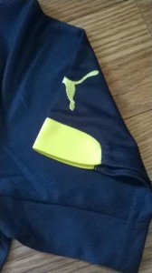
Moving onto the sleeves, notice the yellow accents on the sleeve edges. The shape of these accents is abstracted (sort of trapezoids), which probably helps the yellow shapes balance themselves with the sleeves’ black. Moreover, the yellow accents are strong enough to mark the sleeves’ ends and highlight arm movement without overwhelming the sleeves. Finally, you won’t find the yellow lines on the sleeves either, which keeps the look clean.
Returning to the front panel, check out the BVB crest: it’s an applique. Wearers of Germany’s World Cup-winning home kit will recognize this detail with its unique texture. On the Dortmund kit, the applique’s surface absorbs light smoothly, like a matte metal finish. The effect is quite attractive:
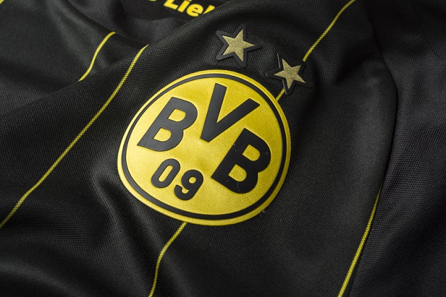
The two stars above the crest, which symbolize BVB’s five Bundesliga titles, are also appliques with the same attractive texture. The applique texture stands out, thanks to a contrasting effect created by the black shirt. It will be interesting to see if these applique crests continue in popularity as an updated contemporary technique for showing off club crests.
Next, let’s flip the kit around and look at the back panel. It’s an all black background. No frills. Two yellow details mark this panel: “BVB” on the top and “DORTMUND” on the bottom. The font family for these words is similar to last season, but less whimsical – almost as if someone glued the stylized letter ends together to tidy the font, which makes sense within the overall shirt design with its coherent structure.
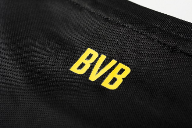

Anyhow, the sans-serif font is bold and clear. There’s no mistaking whose kit you are looking at.
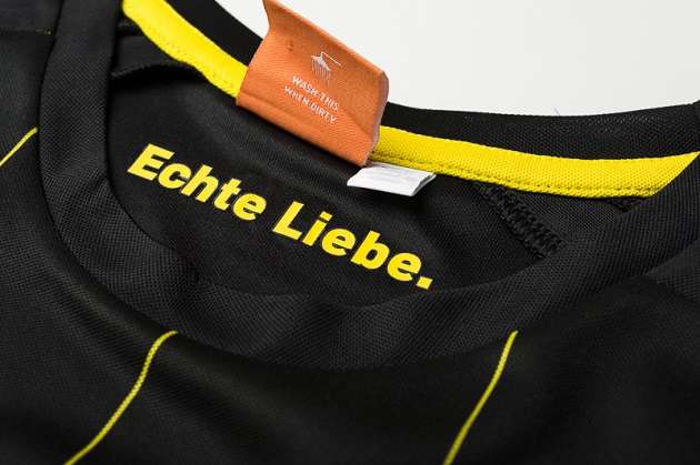
Okay, one more detail. Look inside the collar. Here you will find Dortmund’s current motto: “Echte Liebe,” which translates to something like “authentic/unconditional love” – a motto that beautifully declares the special deep-seated passion between the club, its city, and its supporters.
Before we’re done, there’s a final surprise this away shirt has for you. Look inside the shirt behind the front panel:
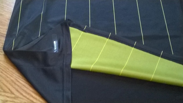
It’s yellow. Yup. BVB can’t escape its favorite color! But this colorful surprise works some magic by adding a golden glow behind the black front panel (I don’t know how else to put it). The look is subtly mesmerizing, especially when you notice that the black is not a solid black, but instead a black with movement and shifting light. Cool. The effect is strongest in direct sunlight. In fact, I didn’t even notice this “hidden” yellow panel until I had the kit for a few days. It sneaks up on you.

at 08:36
i love borrussia dortmund